

Adapting Your eCommerce Storefront for Tablets: A Modern Guide
The surge in tablet popularity has significantly altered consumer behavior, prompting many online merchants to adapt their eCommerce storefronts accordingly. In 2023, global tablet shipments totaled 135.3 million units, although this represented a 10% decrease from 2022 due to various market challenges. Despite this decline, tablets continue to be a crucial platform for online shopping, offering a better browsing experience than smartphones and more portability than laptops (Canalys) (IDC).
The Rise of Tablet Commerce
Tablets provide a more accessible online shopping experience, and their impact on eCommerce is undeniable. The larger screen sizes and portability make them ideal for on-the-go shopping. By 2023, Apple remained the leading tablet vendor with a 40% market share, followed by Samsung at 19% (Canalys) (SamMobile).
Adapting Designs for Tablet eCommerce
Rather than creating separate designs for various mobile devices, merchants are now using adaptive design techniques. Leveraging CSS3 media queries to optimize viewing across different platforms, browsers, and resolutions ensures a smoother user experience. Tools like Less Framework 4, an open-source CSS grid system, simplify the creation of adaptive websites. Websites should cater to resolutions suitable for both landscape and portrait modes (approximately 1024 pixels) to minimize the need for zooming and swiping (MAXIMIZE MARKET RESEARCH).
Avoiding Separate Tablet-Specific Storefronts
While customization is crucial, creating a completely separate tablet-specific version of a website can be counterproductive. Different websites can confuse visitors who are accustomed to the desktop version, leading to frustration and potential abandonment. If a tablet-specific version is created, always offer a way for visitors to switch back to the desktop version (MAXIMIZE MARKET RESEARCH).
Embracing Traditional Technologies
Technologies requiring browser plugins or additional software may not be supported on tablets. Merchants should avoid using Flash, as it is problematic on desktops and unsupported on devices like the iPad and Windows 8’s Metro UI. Additionally, avoid using loud audio that could annoy users in public settings (MAXIMIZE MARKET RESEARCH).
Enhancing Navigation for Touchscreens
The human finger lacks the precision of a cursor, necessitating design modifications to accommodate touch navigation. Buttons and fonts should be larger for ease of use, and key navigation areas should be clearly visible without requiring zooming or swiping. However, excessively large fonts can limit on-screen information, requiring users to swipe more. Simplified interfaces with larger photos and single vertical list menus are more user-friendly (MAXIMIZE MARKET RESEARCH).
Optimizing Ads for Tablets
Tablet users consume content differently than desktop users. According to a GfK MRI report, 71% of tablet owners use their devices to read digital publications, with many preferring the ability to click on ads and make purchases directly. This trend indicates that digital magazines could become significant advertising platforms for eCommerce businesses. Integrating "Buy Now" or "Add to Cart" buttons within digital media can lead to more immediate sales (Canalys) (MAXIMIZE MARKET RESEARCH).
Creating an Engaging and Interactive Storefront
Tablet users expect interactivity and engaging content. eCommerce businesses should leverage HTML5 tools to create dynamic content, such as 360° product images, that enhances the shopping experience. Embracing multimedia and video content will likely appeal to tablet users and drive engagement (MAXIMIZE MARKET RESEARCH).
Gathering Customer Feedback
As with any new marketing strategy, ongoing assessment is crucial. Online merchants should test new ads, designs, and features, and gather data to evaluate their effectiveness. Push notifications and tablet-optimized emails can help maintain brand awareness and engage with consumers. Regularly collecting and integrating customer feedback will ultimately lead to an optimal design that reaches more users (MAXIMIZE MARKET RESEARCH).
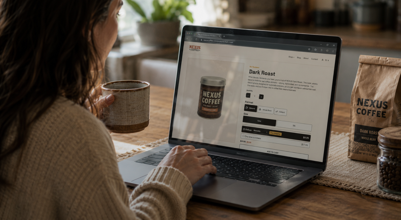
Optimized eCommerce with UltraCart
All UltraCart storefronts are optimized for mobile eCommerce, ensuring a seamless shopping experience across all devices. From the homepage to the item pages and the checkout process, UltraCart provides a fully optimized, user-friendly platform that caters to the needs of tablet users. This comprehensive approach helps online merchants stay ahead in the competitive eCommerce market, delivering a superior shopping experience that meets the expectations of modern consumers.